Information Design to Model Bird Data
Summary
What do you do when you're handed over 30,000 rows of data? Make it usable! Or at least try your best. I was in a team of 4 which attempted to make historical data on the number of washed up sea birds on Aotearoa's coast lines more interesting.
Context
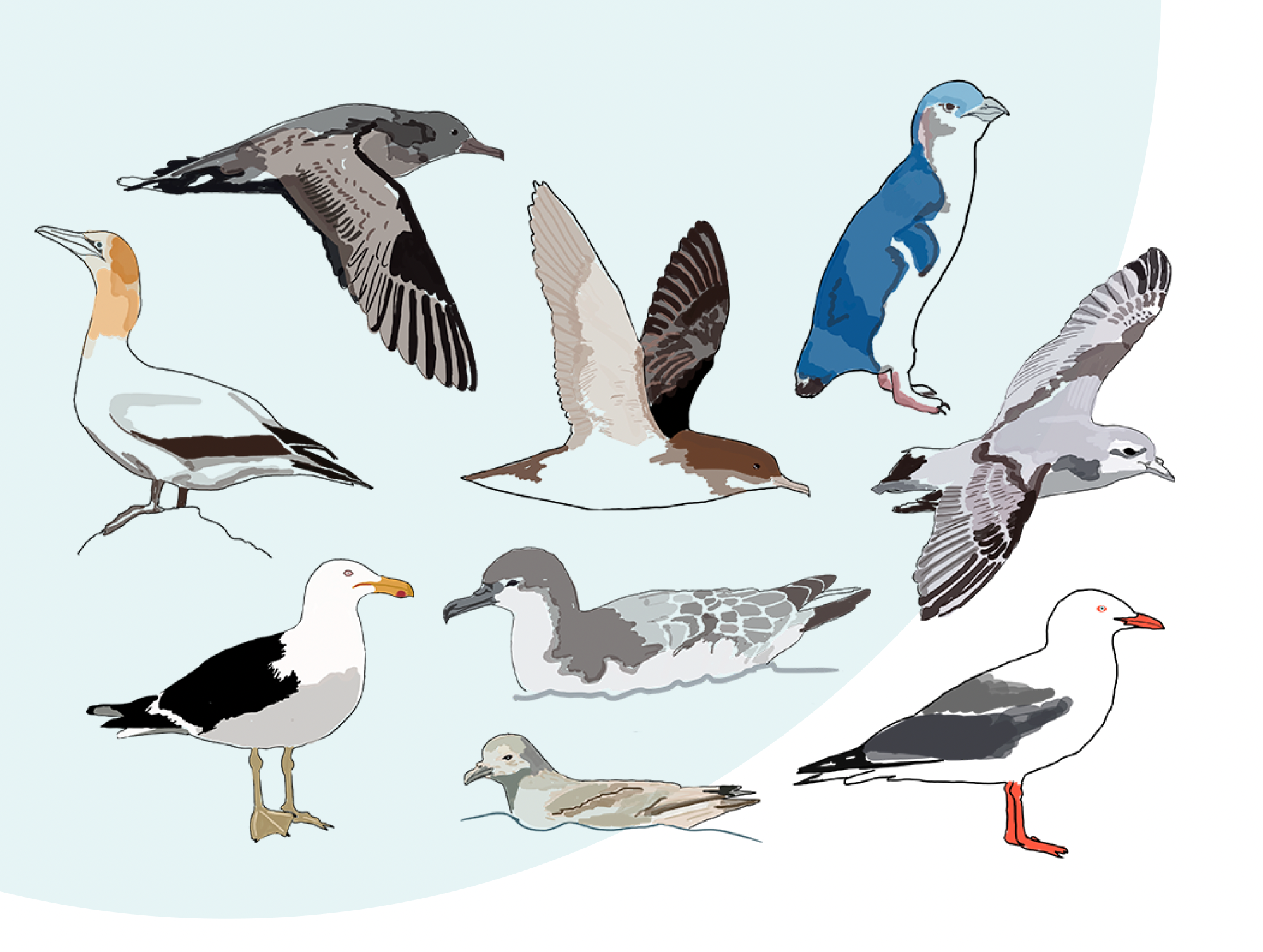
For the past 70 years BirdsNz have collected a mass amount of data. A table with over 30,000 rows contained information of sea birds that had been found washed up on beaches across Aotearoa over the last 70 years. But nothing was being done with!
Brief
We were placed in groups of 4 and tasked to create engaging data visualisations using the data provided to us by Dragonfly on behalf of BirdsNZ. The motivation for the visualisation was to increase engagement and peak interest amongst existing and potentially new BirdNZ members
Process
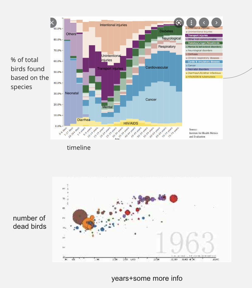
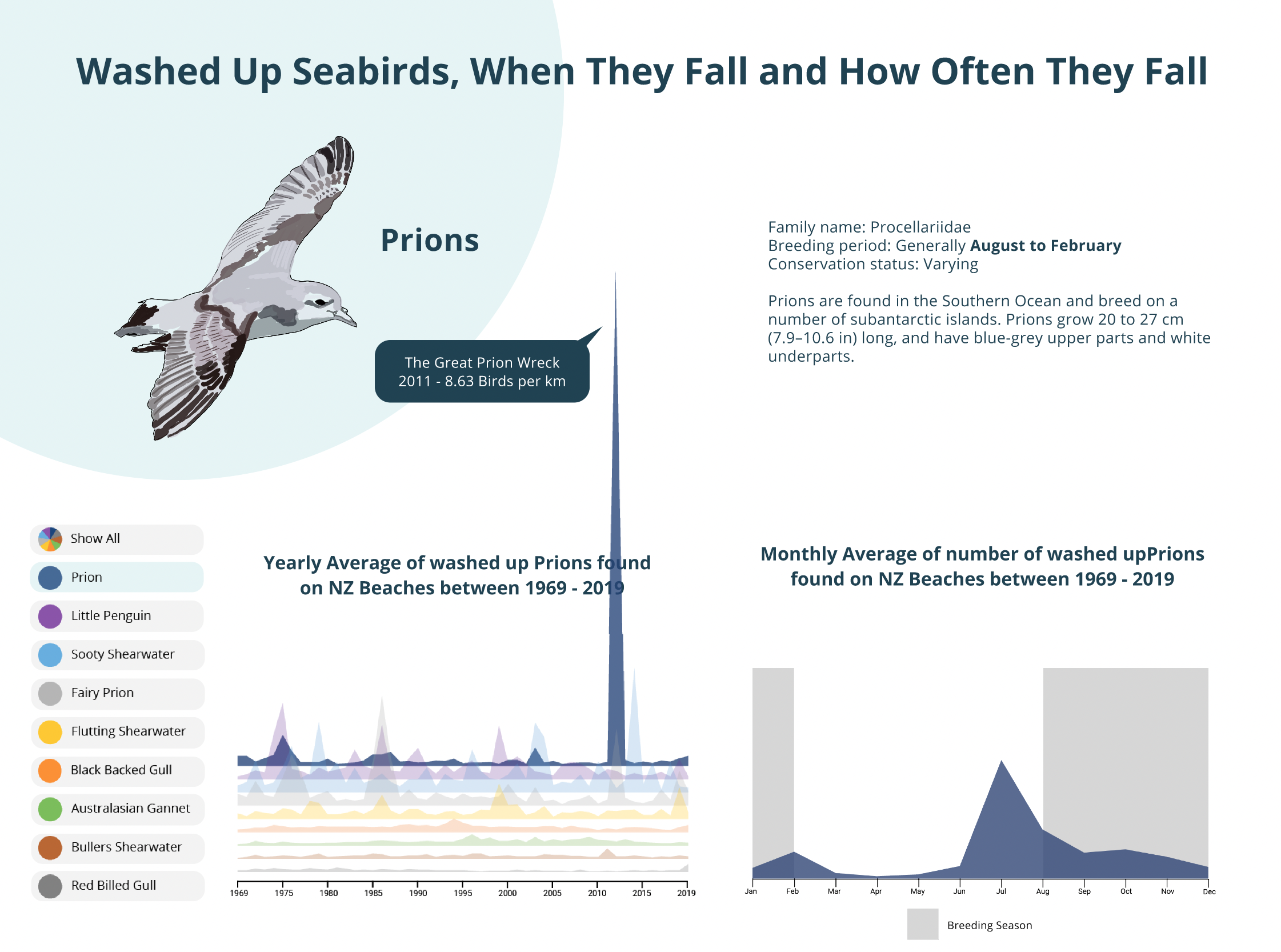
I took on the role of facilitator and coordinator for the group. We had meetings to set out tasks, collaborate on research and share findings.We began by playing with the vast amount of data trying to see if there were any interesting trends that we could base our visualisations around. Quickly we discovered a few interesting peaks that we connected back to certain events that were significant enough to make the news. This gave us a sturdy basis for a visualisation.
Through rounds of concepting and user testing we ended up with one final format and crafted and delivered it through Figma. We gave a 7 minutes presentation to clients from Dragonfly and BirdsNZ who were pleased with the final concept.
Testing
We had 3 concepts which we tested across a variety of users. This information design work was intended to be consumed and enjoyed by as many different demographics as possible to get engagements up.
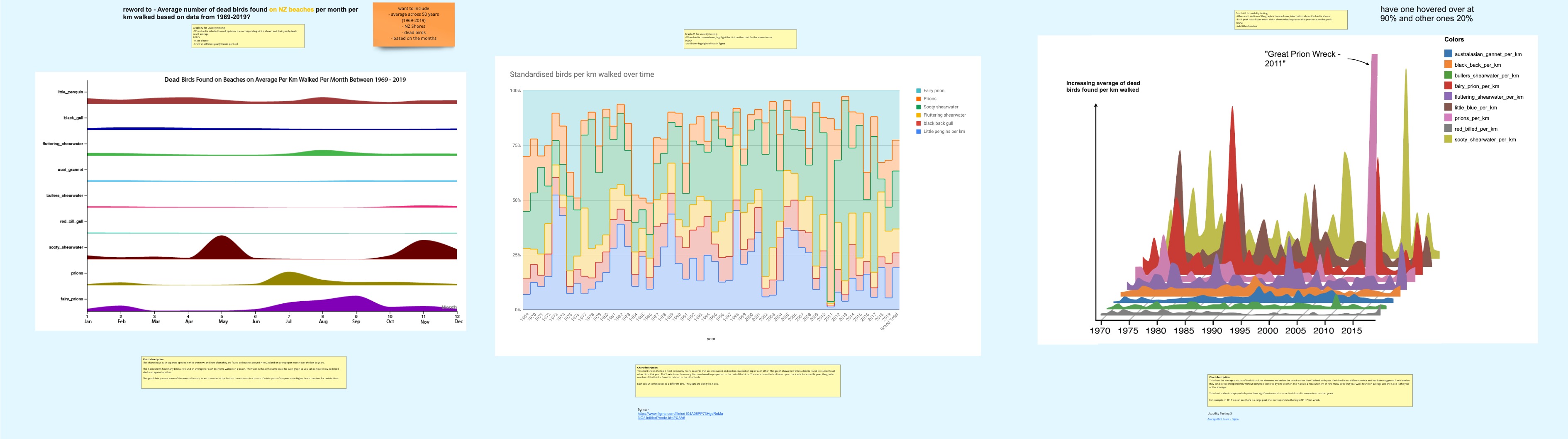
The 3rd design was the most well received so with some alterations we moved forward with it and created charts to represent each species of bird that we had information on.
Solution
Each bird had their own interactive page on this interactive visualisation.
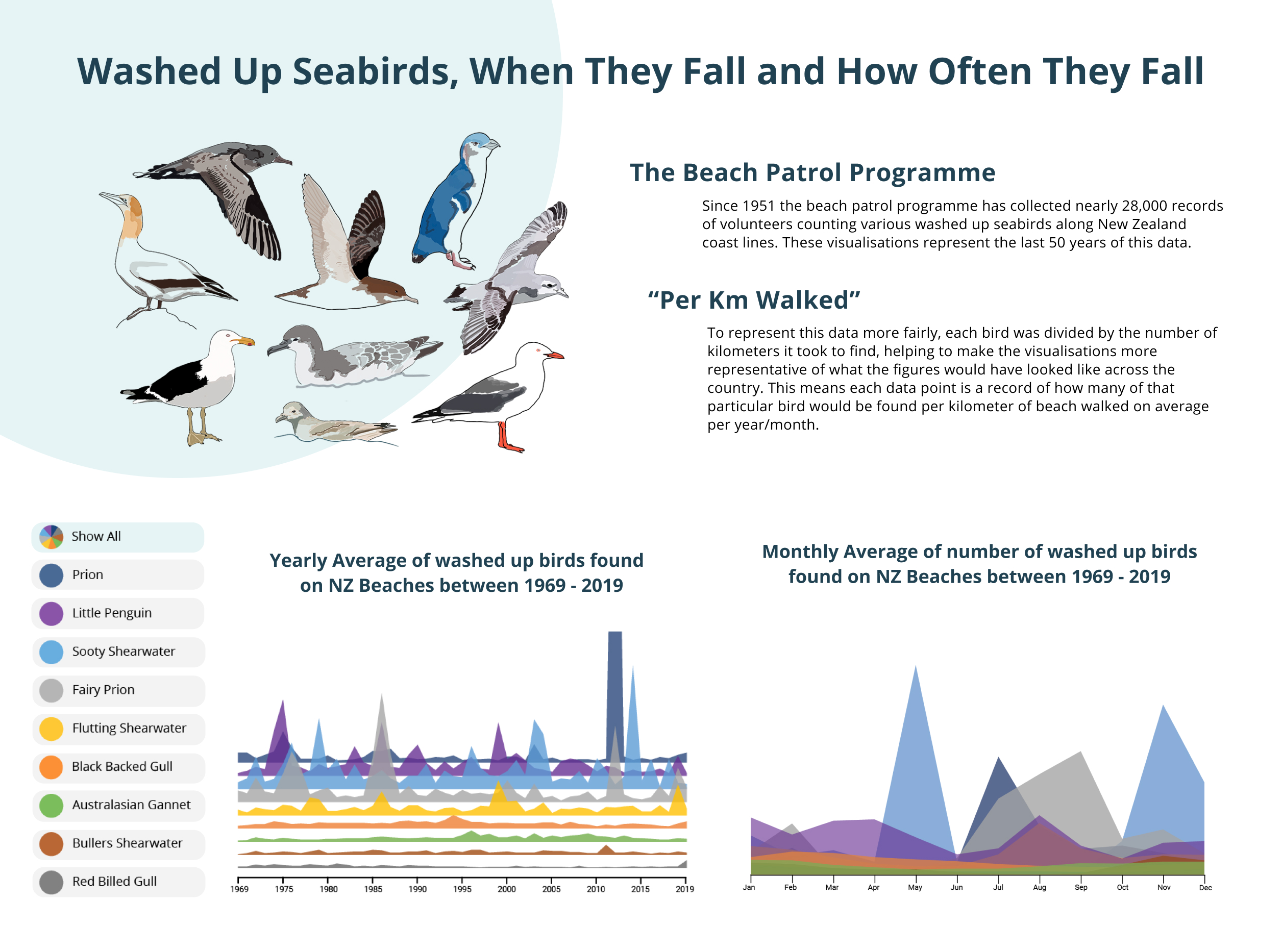
We incorporated each bit of useful information we had gathered regarding interesting peaks and troughs. As well as breeding information for each bird and any other specific information relevant.
Reflection
The project was well received by the clients at DragonFly and they even ended up writing a small article on the work done which can be found here. Working in a team with 2 different timezones, 3 different locations and people working different schedules made this project a challenge at times. But through effective handoffs and planning we were able to make this work. The DragonFly team and those at BirdsNz were delighted to have a way to show off all this data after so long. Only now to make it updatable...